For People Inn Love with a Great Pizza Experience
In addition to talking with Pizza Inn’s leadership team, we met with several family-owned franchises, many passed from generation to generation, to better understand Pizza Inn’s brand roots.
Through a long history with plenty of bumps in the road, the Pizza Inn brand became fragmented from location to location. Each store faced a list of issues, including dated finishes, fixtures, and remnants of past remodels.
Our most important task was to bring the fleet back together under one cohesive voice aligned with the overarching brand, which was also undergoing a complete overhaul.
Hicks Nurseries
Retro Americana
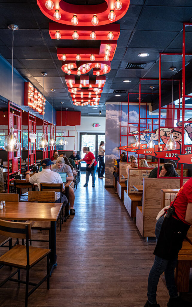
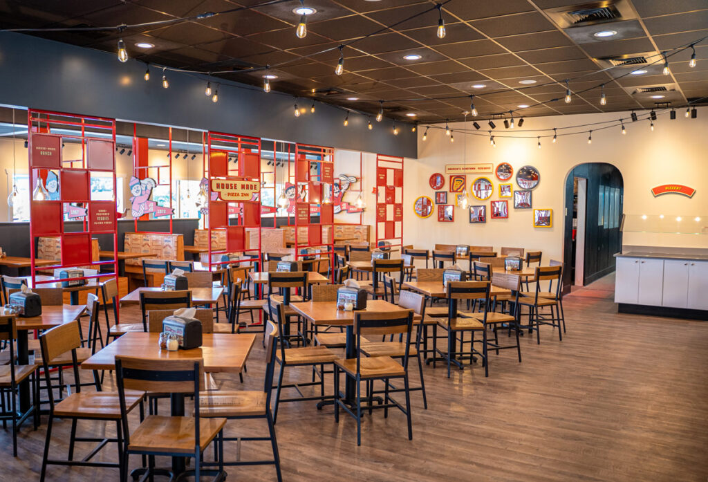
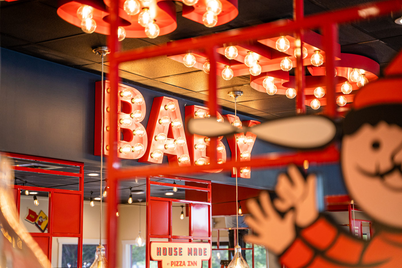
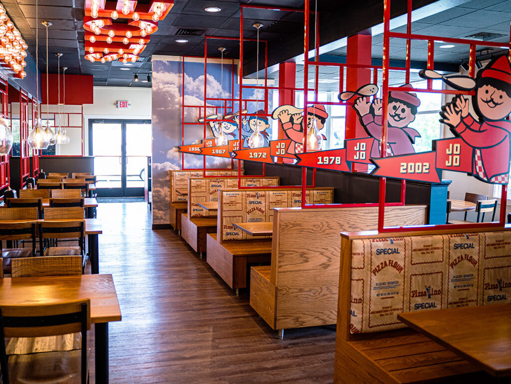
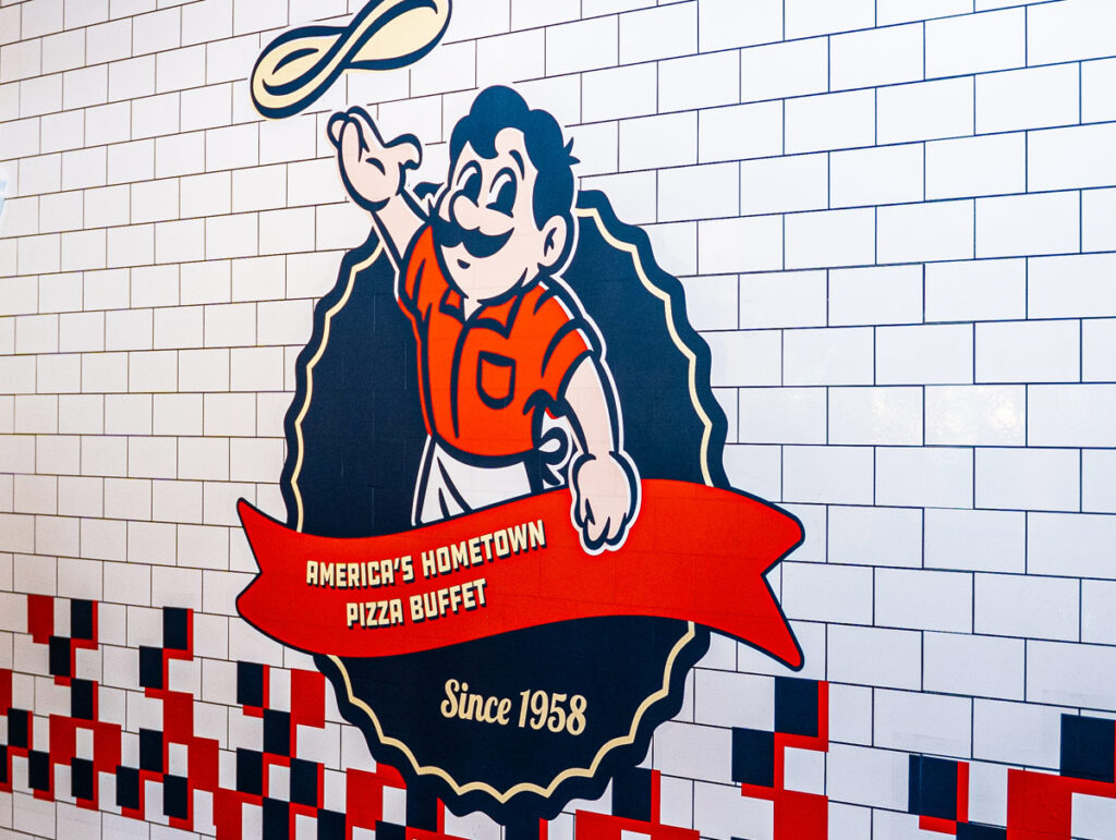
As part of the rebranding process, Boone Oakley, an advertising agency based in Charlotte, NC, infused the new Pizza Inn identity with fun, retro-inspired energy. Working alongside their team, we were able to translate the same design filters to the branded environment, highlighting the neighborhood feel at the root of the brand.
From the vintage-styled buffet and salad bar faces that look like old tile work to the sundae bar and localized graphics designed with large arrows and shapes reminiscent of mid-century signage, every moment feels unique and branded for Pizza Inn. Tiled sections on the floor accentuate key points in the guest journey, such as in front of the buffet, at the entrance, at pickup, and at the host stand. The entire restaurant is full of easter eggs that transport the experience back to something familiar but fresh.
The introduction of blue, off-white, and yellow into the brand was a breath of fresh air that allowed us to play with more color and energy, which the family restaurant desperately needed. By collaborating, we were able to seamlessly transform a tired, dated, incohesive brand loved by families for generations into a brand full of energy and life while nodding back to its true American roots.
