Creating a Fresh Brand From the Ground Up
What if we designed an environment that helps change the way people view and experience high-quality, healthy food? What if the space became a canvas for the ingredients to shine?
Chop5 called on us to create a convenient fast-casual concept for their crave-worthy, customizable salads. We worked together to create an experience that champions fresh and quality ingredients in an engaging, genuine way.
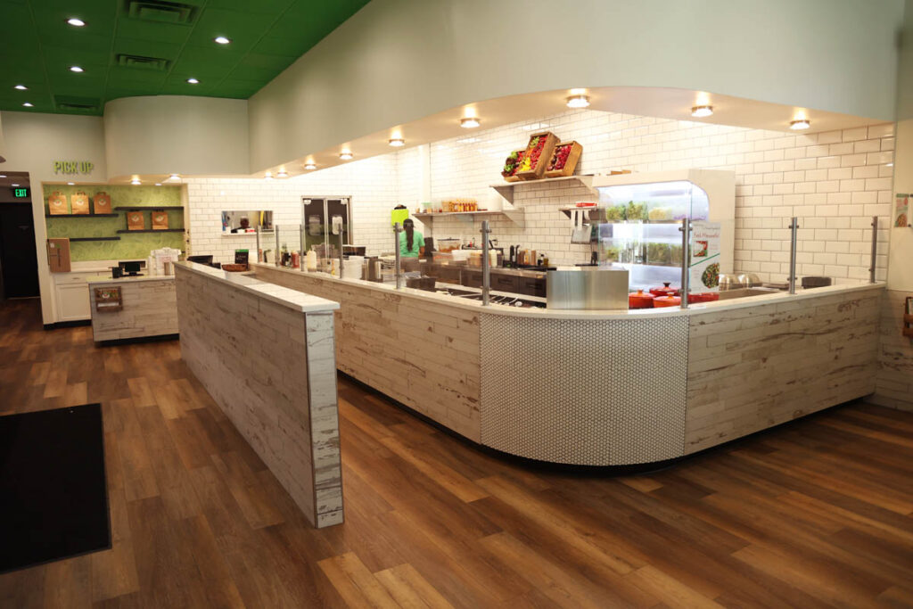
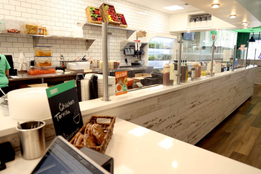
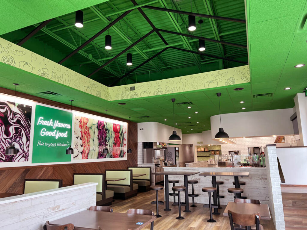
The Chop5 environment creates a lively, inviting experience that makes customers feel like they’re stepping into a sparkling-clean kitchen full of friends. Welcoming team members positioned along the customer journey share chef-inspired menu options and help each guest craft their perfect salad.
Hicks Nurseries
Healthy Doesn’t Have to Be Boring
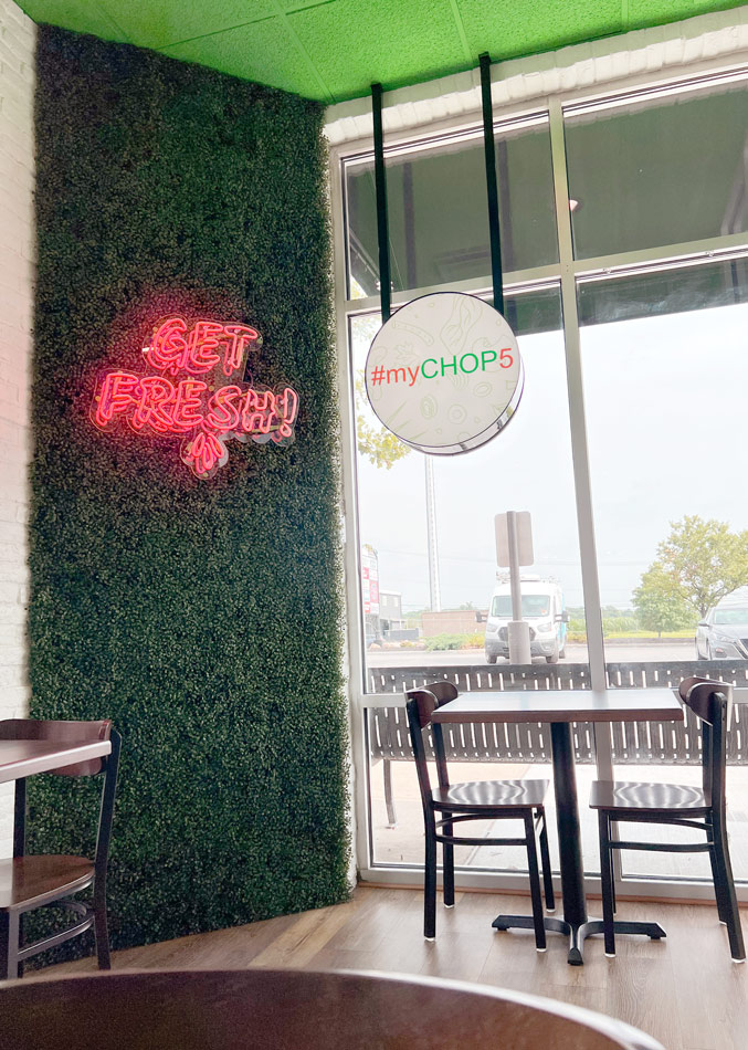
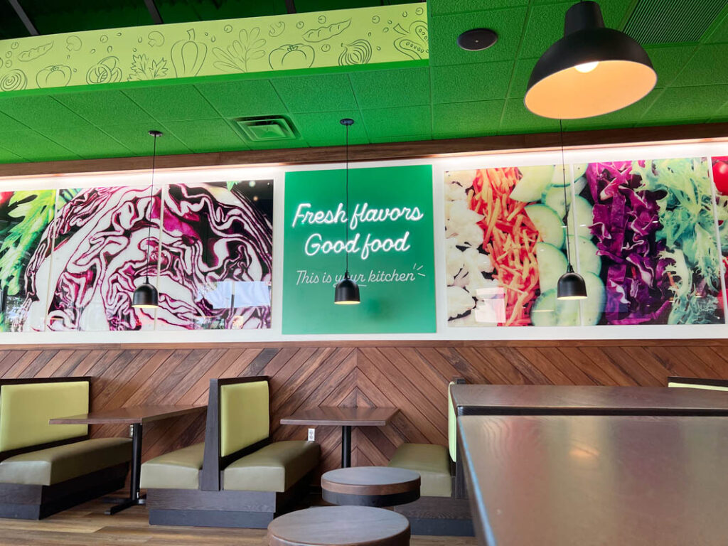
The color green accents the space to enhance the focus on freshness and is paired with bright natural light and white tones to open up the space. Tactics such as keeping the salad line primarily white let the stars of the show, the ingredients, truly shine. The brightness of the space is balanced by wood elements to avoid a clinical, sterile feel, and provide a sense of quality and warmth.
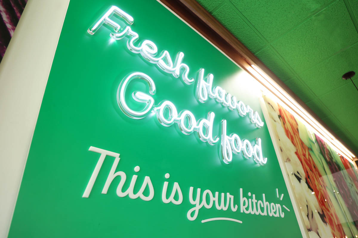
Our main focus was to communicate fresh in a way that feels natural, not tacky, and true to the core of the brand. The use of various brand patterns, custom graphics, fun signage, and a large ingredient-focused focal all work to provide an atmosphere centered around quality where guests can craft flavorful, regret-free dishes.
Chop5 is in growth mode, and continuing to plan for restaurant expansion, with this design serving as the base for their future success.
